


GlassboxAqua is a startup selling gear and aquatic plants for aquarium hobbyists. The founder had a name—but needed a full visual identity. I designed three logo options and brand mockups, exploring styles from modern minimalism to organic elegance.
Tools Used


Challenge & Discovery
The founder, an aquarium enthusiast, wanted a clean, modern brand to sell high-quality plants and gear through dropshipping and retail. His goal: bring a premium, nature-inspired feel to the hobby.
1
NATURAL IDENTITY
Establish a visual identity that feels modern, elegant, and rooted in nature.
2
MULTI-PURPOSE
Designed to work online, offline, in print, and on merch.

Natural wood textures, underwater plant structures, flowing organic forms, and serene, minimalistic layouts. The goal was to capture motion and stillness—balancing high-end appeal with grounded naturalism.
Moodboard
Headings font
Subheadings / Body font
Colour Selection
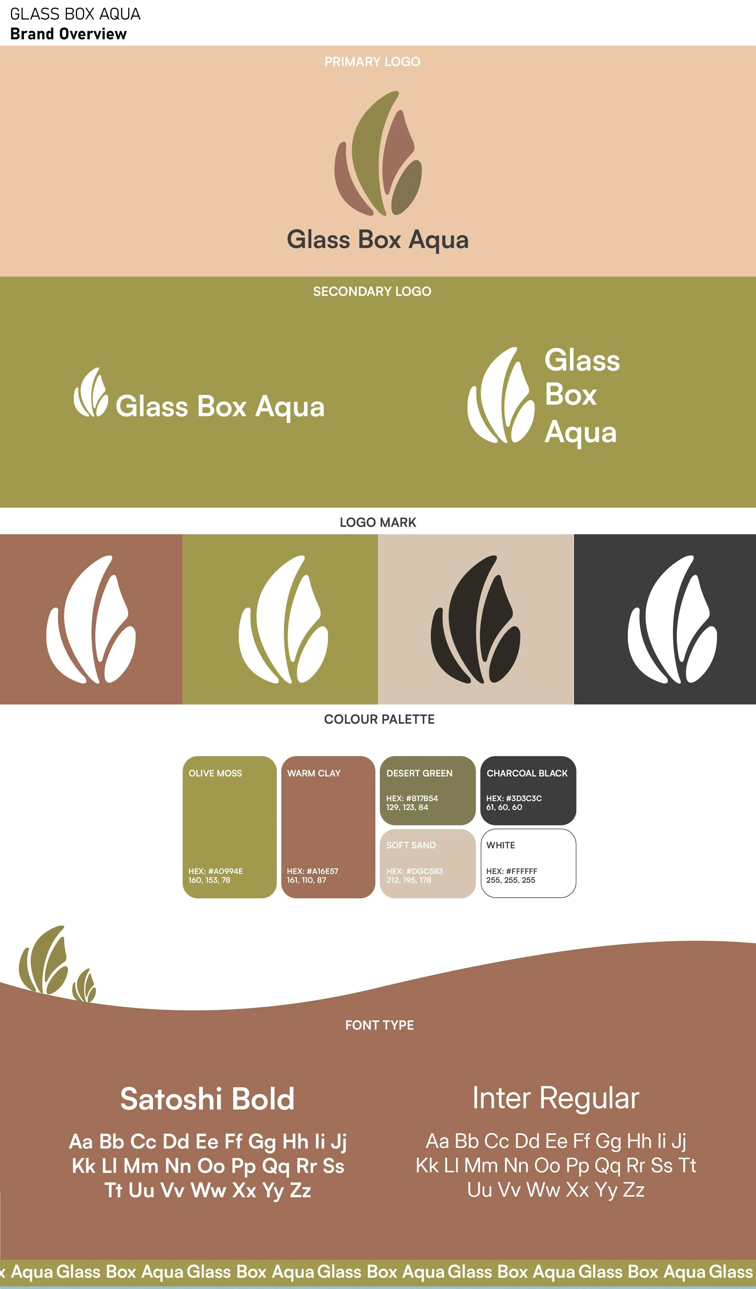
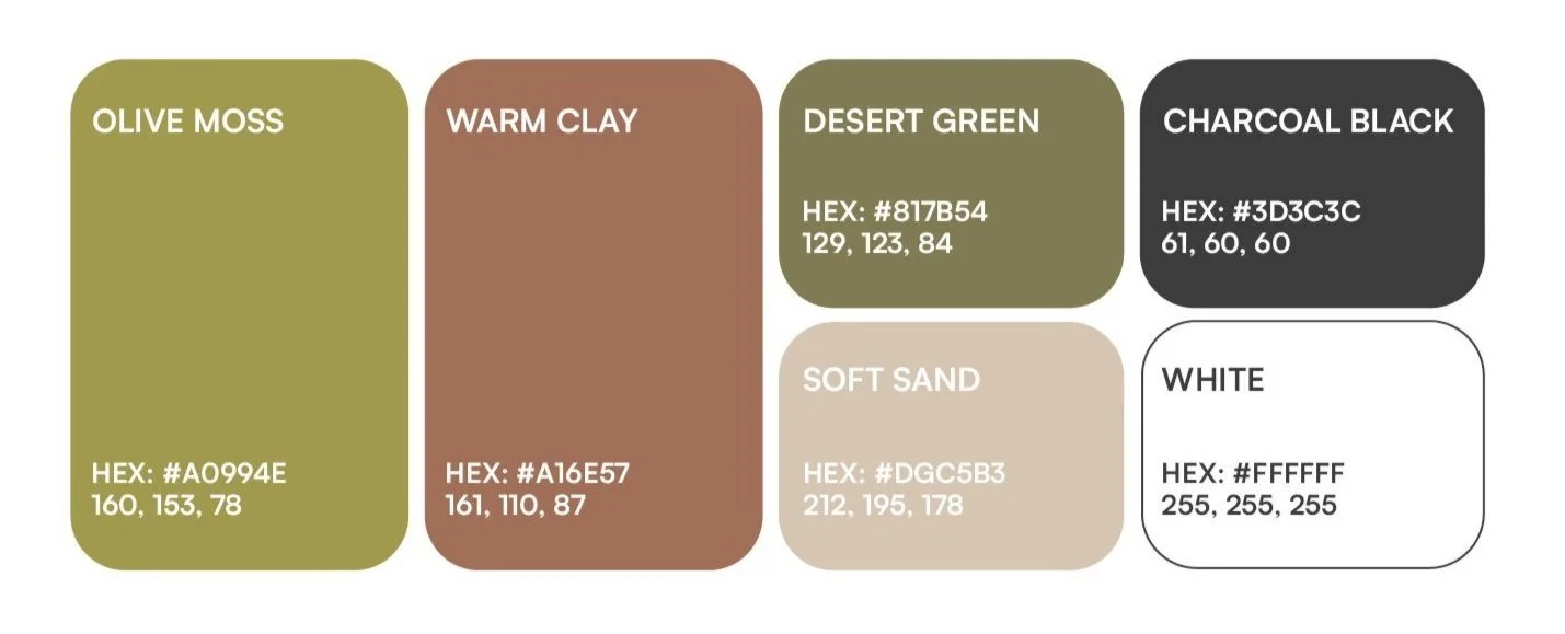
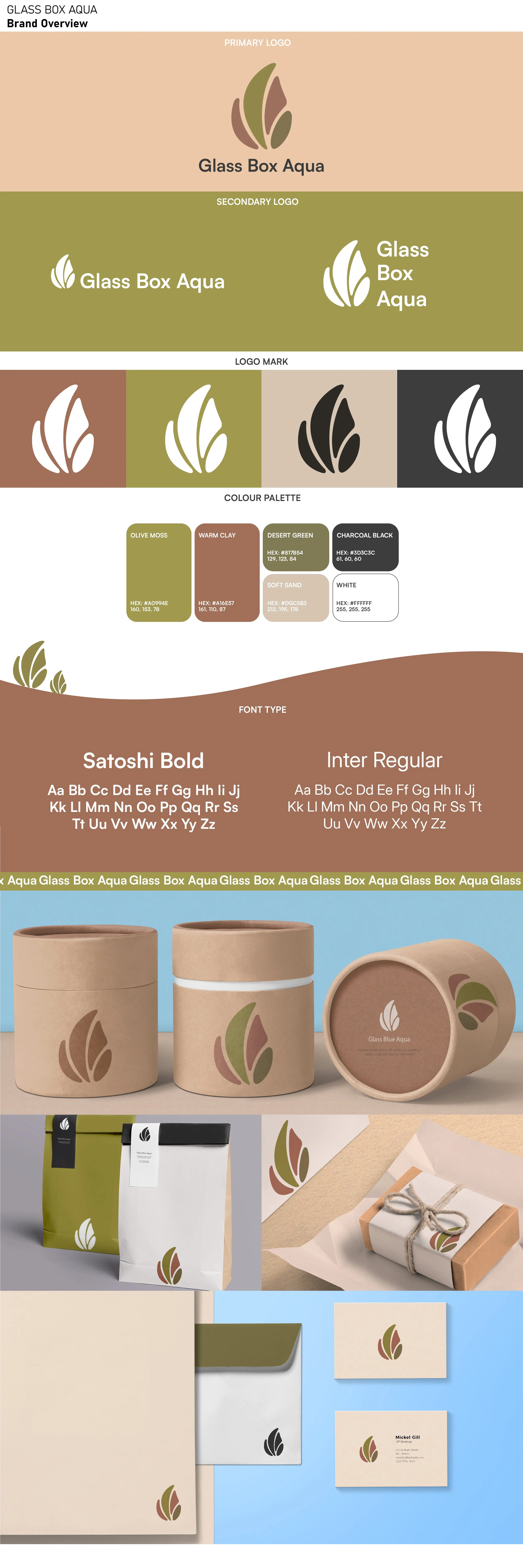
I curated a set of tones that feel warm, earthy, and fresh. These tones bring a quiet sophistication while echoing the brand’s connection to nature.
Visual Identity
I chose Satoshi Bold for its clean, modern feel that adds structure and clarity to the brand.
Paired with Inter Regular, a highly readable and neutral typeface, the combination feels fresh and professional while allowing the organic visuals to shine.
The client was drawn to earthy tones and organic textures—grounded yet minimal. I explored soft, flowing shapes and neutral palettes inspired by aquatic plants to capture a calm, refined feel.
Visual Identity
I shared three unique logo directions, each inspired by aquatic plants and organic forms. They all balanced flow, nature, and modern simplicity—giving the client distinct, thoughtful options to represent their brand.
This logo features three leaves connected by a single stem, forming a soft circular shape. It’s clean, minimal, and balanced—perfect for a brand centered on clarity, nature, and calm.
This logo uses four soft, flowing shapes to form a stylized aquatic leaf. Each shape reflects a color from the brand’s palette, creating a vibrant yet grounded look. The design feels calm and fluid—like a plant drifting underwater.
Logo Development
Organic Forms
Concept 1
Concept 2
Palette 1
Palette 1
Version 1
Version 2
Concept 3
Version 1
Version 2
This version pairs a large and small leaf connected by a curved stem, forming an almost complete circle. The asymmetry and negative space add visual interest, while the soft shapes and colors keep it feeling natural and refined.
After choosing the “Leaf” logo, the client asked for a smoother, more dynamic shape. I refined the design to create a gentle rightward swoosh, suggesting growth and movement.
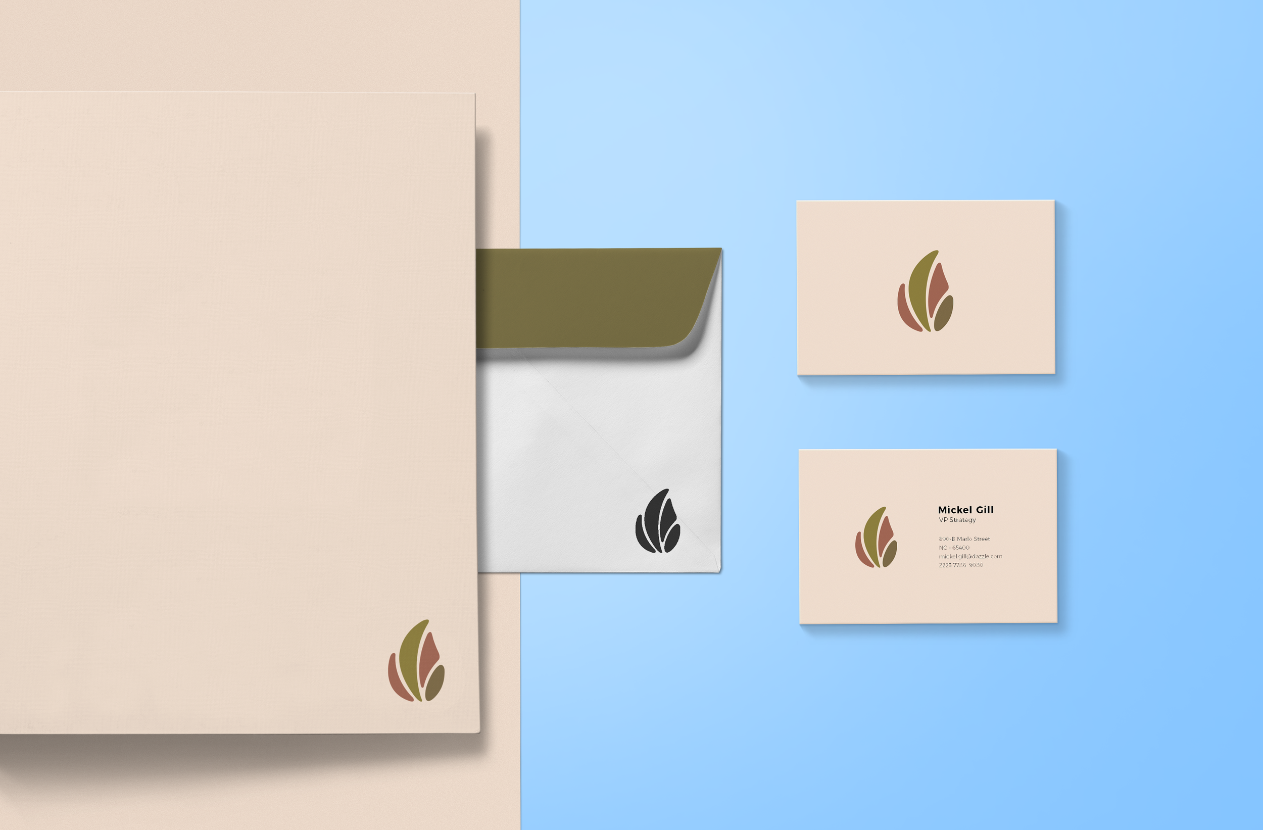
The final result is a clean, organic mark that works across digital and print. It scales well, feels rooted in nature, and reflects the brand’s calm, modern tone.
I delivered all logo files (SVG, PNG, JPG) with organized folders for color variations, mockups, and ready-to-use brand assets.
Final Direction & Delivery

Closing Thoughts
This project was a great chance to build a brand from scratch. I worked with the client to shape a clean, nature-inspired identity. It reminded me how important clear communication and scalable design systems are from start to finish.
Tools Used