
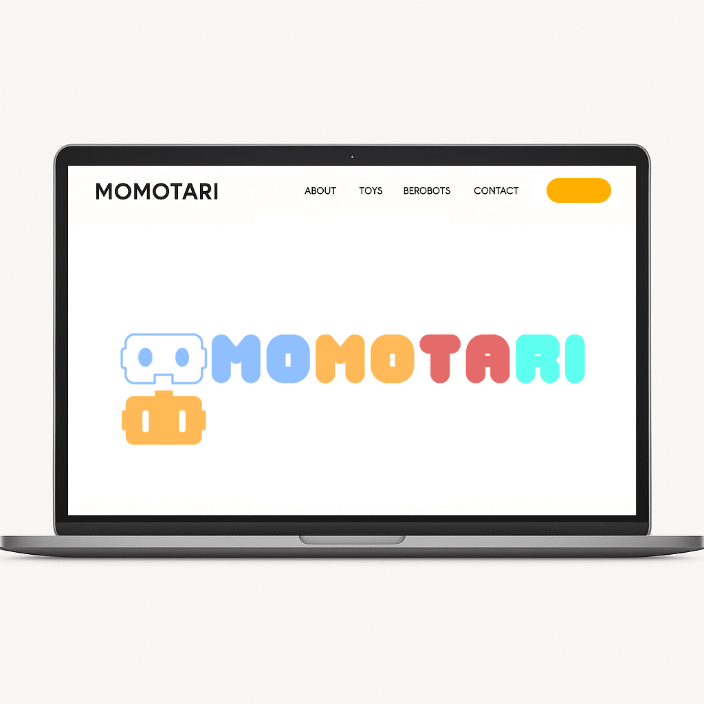

Momotari is a playful toy retail brand that started as a passion project, selling toy-related merchandise and reviewing Lego builds. The founder had no visual branding to start with, so I created a full identity system—from sketches to logo to mockups—that brought Momotari's world to life.
Tools Used

Problem & Research
Before the rebrand, Momotari didn’t have a logo, color scheme, or recognizable look. Everything was done informally, making it hard to grow or connect with an audience.
To give the brand a strong and lasting foundation, I focused on building a design system that felt fun and familiar—something that could speak to kids, collectors, and casual fans alike.

Playful Colors & Fonts
Bright, toy-like visuals that feel creative, fun and exhibits play.

Fun, Recognizable Identity
A brand look kids and fans can instantly connect with.

Flexible Logo System
Designed to work online, offline, in print, and on merch.


The visual identity started with exploring the founder’s interests—mainly retro robots, toys, and collectibles. I curated a moodboard featuring bold, nostalgic references: Gundam models, Lego packaging, and the bright, playful charm of Toy Story. These elements helped define the visual tone as both imaginative and approachable.
From this, I built a style that blends futuristic toy elements with bright and cheerful colors.
Inspiration & Moodboard
Visual Identity
Headings font
#5FFFF0#E66A6A#FFB958#8FBFFFSubheadings / Body font
#000000Colour Palette
Color Palette Selection
Typography
The colors were selected to spark instant joy and recognition—drawing from classic toy palettes. The colours work together to evoke energy, imagination, and fun. Black grounds the palette, giving contrast and structure.
I paired Jellies for headlines—a bubbly, fun typeface that feels right at home in a toy box—with Inter for supporting text, keeping things legible and clean. Together, they balance playfulness and clarity.
I started with fast, loose sketches to explore what Momotari could look like. From robot faces to building block shapes, I played with icons that could double as mascots. These early explorations helped guide the form of the final logos.

Ideation Sketching

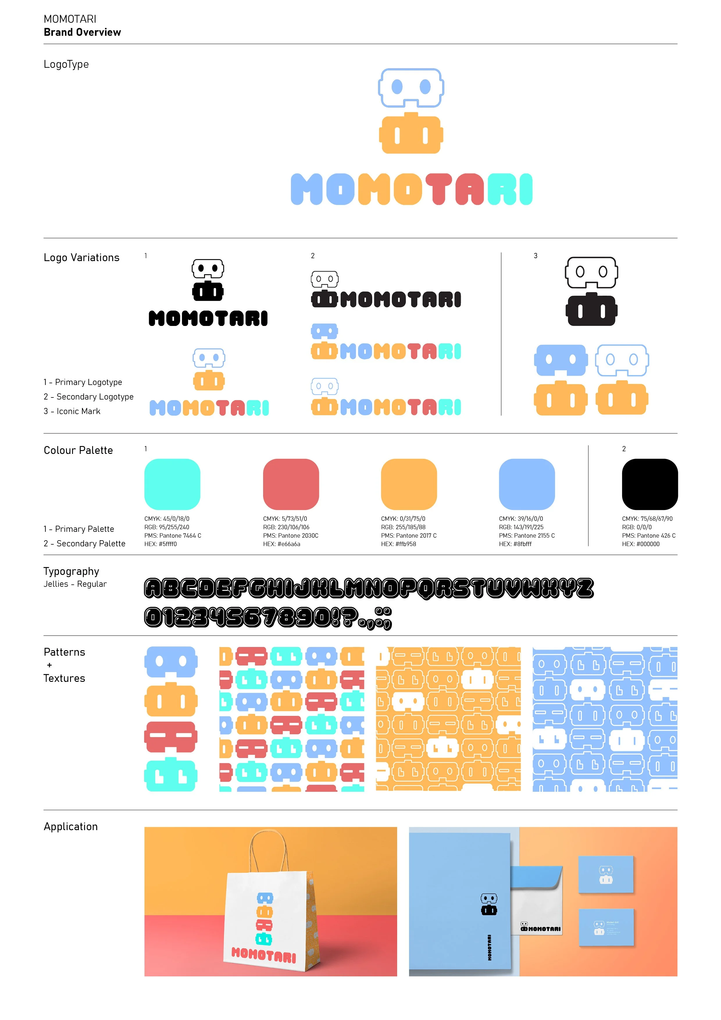
I created three logo variations, each exploring a different take on Momotari’s identity—from playful and bold, to more mascot-like and modular. Each logo was built with full-color, black-and-white, and icon-only versions to ensure flexibility across platforms.
A minimalist, friendly mark that doubles as a robot and a monogram. The rounded forms and soft blue tone make it clean, memorable, and easily adaptable across print and digital touchpoints.
A bold, character-driven logo combining toy aesthetics with a tech edge. The red twin shapes suggest motion or signal, while the dark backdrop highlights the brand’s playful confidence. The colorful type brings balance and approachability.
Logo Development
Visual Identity
Concept 1
Concept 2
Palette 1
Concept 3

A modular, mascot-based system made for motion and flexibility. Each character has its own personality, contributing to a vibrant, collectible feel. Ideal for brand storytelling, merch, or interactive assets.
After a live-stream presentation with the client, he chose the third logo—playful, clean, and the most versatile.
I refined the design and delivered a full brand package: logo variations, color and type guides, print previews, and even animated concepts for digital use. Everything was designed to feel bold, friendly, and easy to apply across platforms.

Final Direction & Delivery
Seeing the brand in action was the most rewarding part. The client used the new logo and colors in a YouTube toy review video—bringing the brand to life just as we envisioned. It showed how adaptable the identity could be, even in casual, real-world settings.

Branded YouTube Content
Real-World Use
Final Thoughts
This rebrand taught me how to turn early sketches into a cohesive, playful identity that works across formats. From concept to real-world use, I gained valuable experience in presenting, refining, and delivering a full branding system. I’m proud of how it came together and how it resonated with the client.
Tools Used